Reproducing paintings, drawings or other art is one of the things we do most frequently. Sometimes artists are simply wanting a quality, high resolution file of their work for archiving purposes while other times people are wanting to make prints so that they can sell their work. In either case there are usually questions when it comes to painting reproduction.
The most common question that we get about art reproduction is “How does this whole thing work?”
There are several steps involved in reproducing paintings in order to make sure you get the highest quality file or print possible, and there are also multiple ways that you can go about it. Some people want to take their work to professionals to be reproduced while others want to try to do it themselves. We have a page on our website dedicated to art reproduction, but in this article I’ll tell you more in depth about how art reproduction works and, in particular, about our process.
DIGITIZING

Before your painting can be reproduced a digital image must be created so that it can be put on a computer. Some people will scan paintings for reproduction and others will photograph them. We do both. There are merits to both approaches so we choose the one that best suits your original.
SCANNING
Scanners have the advantage of being able to dial in the resolution which means that you can often get higher resolution results from a scanner because a camera’s resolution will be fixed no matter the size of what you put in front of it. However, a scanner has a fixed bar of light that you cannot move, and so that means if you have a painting with high reflectivity a scanner is likely to cause a lot of glare in your final image.
For scanning we use an Epson 11000xl Photo scanner with Silverfast professional scanning software. It will handle paintings up to about 12×18″ (we say about because it’s technically designed in centimeters) in one piece and does a great job capturing detail and getting faithful colors. With some art we can scan in multiple pieces and stitch them together into one final piece. Scanning can get you the highest resolution in cases where your original is well suited to scanning.
PHOTOGRAPHING
Photographing allows for the repositioning of lights to help moderate glare and it also doesn’t have the size limitations that scanners do; a scanner bed is only so big but we can hang a huge painting on the wall and photograph it.
For photographing we use a high resolution Nikon Z 7 mirrorless camera. We hang paintings flat on a wall and light them properly (more on that in a moment). We put our camera on a tripod for stability and use an Arca Swiss C1 Cube geared head which results in clearer, more square images. We also use a high quality lens that does a good job with flatness, sharpness, and minimizes any distortion that can occur during the photographing process. It is best to shoot at the lowest ISO possible (we shoot at ISO 64) to minimize any quality loss from noise, and to use an aperture that best balances depth of field, sharpness, and diffraction (we usually shoot at f/8). We also dial the white balance of the camera in to a custom white balance made specifically for the lights that are being used and build custom camera profiles to maximize color accuracy. Then, when everything is set, a high resolution photo of your painting is taken. All our images are shot in RAW to maximize color depth.
Photographing also has the advantage of being able to use a process called cross polarization to deal with paintings that are glossy and thus produce heavy glare.

High Resolution Camera and Studio Lighting
As a general rule we feel that paintings which are in the 24×36 range or smaller can be adequately captured in one single photograph and maintain acceptable resolution, though there are of course exceptions to that rule. If your work is larger than that or if you need to dramatically enlarge your art then we may need to take multiple photographs of your painting in smaller pieces and then stitch those back together in the computer to make a single larger file of your painting.
COST
The cost for digitizing art is $25 per piece. This includes either photographing or scanning your painting, drawing, or other work of art (we decide which will be the best option for your work), doing basic overall brightness and color adjustments, and saving high res jpeg and web res jpeg files. We will also give you a copy of the files we create which we can put on a USB drive you bring us or we can share the files with you via a file sharing service such as Dropbox, Google Drive, etc.
If you bring us at least 10 paintings at a time then we will charge you an hourly rate of $100 per hour to photograph. Please note this does not mean the cost is necessarily $100 for 10 paintings. The actual time it takes will vary depending upon several factors (for example, if you bring 15 paintings which are all the same size then that goes more quickly than 15 paintings which are all different sizes). In any case the hourly rate will always save you money over having us photograph them individually.
LIGHTING

We already mentioned that we photograph art for reproduction purposes, and photography really is all about lighting, so it’s no surprise that lighting is an absolutely crucial part of painting reproduction.
We prefer to use 2 lights set at around 45 degree angles on either side of the work, both an equal, measured distance from the work. It is important to use lights with a continuous spectrum and a high CRI. We use Einstein studio flash units specifically because they are well regarded for their ability to deliver reliable, constant color from one flash to the next with minimal color temperature drift which is crucial for photographing art. In this particular respect they outperform many other much more expensive studio lights. There are many light sources out there that are great for other things but not a good choice for art reproduction because they drop out heavily in certain parts of the spectrum and thus are unable to give accurate results when color is of the most concern. When necessary, either a polarizing filter is put on the lens or polarizing film is put on the lights to combat any excess glare (on that note, photographing a painting before putting any glazing or glossy finish on it often makes photographing easier).
The light that you put on your painting will determine nearly everything about the quality of the colors later in the reproduction process, so consistent, continuous, high quality lighting is crucial. Here’s a fun way to think about it:
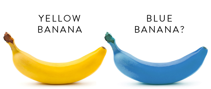
YELLOW BANANA, BLUE BANANA

Why is my banana blue?
Imagine a ripe banana. It’s nice and yellow, right? Now, imagine that you and your bright yellow banana are taken into a completely dark room and the door is shut behind you. You feel around the wall and, finding the familiar shape of a light switch, flip on the lights. Immediately you realize that every light in the room has had a blue bulb installed, so there’s only blue light filling the room. You look over to your yellow banana. What color is it? It’s blue. Well, at least it looks blue.
So what does this have to do with art reproduction? Quite a lot actually. Let’s replace the banana with your painting. Imagine that you take your painting out into the sun and you photograph it. Then you take the painting and your camera inside and put the file on your computer. Next, you set your painting up beside your computer monitor, use your lamp or overhead lights to light the painting, and then adjust the colors on your computer. Just like your banana turning blue in different light, your painting will look different in the indoor light than in the natural light you photographed in. Plus, if the color temperature of your monitor isn’t the same as the room then you have yet a third variation in light. These changing lighting conditions will create serious problems.
The same is true for light sources without the proper ability to render color. You may be able to get certain colors to look good, but others will never quite get there no matter what you do because they’re literally missing from or not equally represented in the spectrum.
And varying color temperature will add to that. May people think about taking their paintings outside to photograph them but don’t consider that the color temperature of light outside is constantly changing throughout the day. And if accuracy and consistency are what you’re going for then you need to know exactly what that color temperature is.
Consistency is key here. We set up our lights, which have a high capacity for showing a wide range of colors, in a room with all the other lights turned off and photograph paintings under just that light so we know exactly what the color temperature is (and as mentioned above we use a custom white balance in our camera created for our lights). Then, when we take the files to the computer to be edited, we will light the painting under the same color temperature lighting we used for photographing to aid in getting accurate, consistent color each time. Using a mixture of lighting will always give you major color consistency headaches!
MONITOR CALIBRATION
This is a good time to mention that using a good, calibrated monitor is crucial when it comes to accurately reproducing color. If you use good lighting, make sure your lighting is consistent, but then use an uncalibrated monitor for your adjusting then you will again run into problems. In fact, it works much like our blue banana earlier. If paintings are edited on a monitor that isn’t showing color properly then you’ll get color shifts. Your monitor doesn’t change anything about the color information contained within the file, only how that information is interpreted and displayed. And so if you’re making adjustments based of this inaccuracy then you will usually be making the file worse on account of it.
On that note, if you take your painting files home and open them on your computer, and you have not calibrated your monitor, then it is a safe bet to say that you’re not properly seeing the brightness, color, etc. of your painting files. Most monitors are much too bright and contrasty before being calibrated. Furthermore, they aren’t balanced to any color standard. The same goes for photographing your paintings yourself or having someone else with a nice camera do it. Without these calibrations you are going to run into color and brightness difficulties.
We use industry leading Eizo ColorEdge monitors and calibrate them with X-Rite i1 equipment, always making sure to keep our monitor calibration up to date. If you are interested in reading more about how to get more accurate colors from your prints or how to calibrate your monitor, then read our separate post about monitor accuracy here.
CROSS POLARIZATION – HANDLING GLARE
One frequent issue when photographing paintings is getting heavy glare from either a glossy paint or a varnish on top of the painting. When this shiny finish is combined with texture of the painting you’ll end up getting a good bit of glare in the final image. This can also be emphasized even if you don’t use a glossy varnish because different pigments dry with different amounts of sheen and thus reflect light differently. One way to handle this is called cross polarization.
To effectively use cross polarization we first put a polarizing film in front of our studio lights. This film takes light waves which are otherwise scattered in various directions and only allows through the light waves that are moving in the same direction. We then use a polarizing filter on our camera which is turned to a 90 degree angle relative to the polarizing film on our studio lights. This lets us cut down or eliminate glare all together by controlling the light which passes through to the camera.
When using cross polarization it’s important to note that, while it is effective at reducing glare, it can affect other aspects of reproduction such as getting the most accurate color. Polarization also works to varying degrees depending upon just how glossy/matte a particular area is. So cross polarization is not necessarily a cure all and should only be used when any potential downsides are outweighed by the benefit of reducing or eliminating glare.
CAMERA CALIBRATION
We have built a custom color profile specifically for our camera and lighting combination that is used during the editing process which helps in maintaining color from photograph to file. It can’t be overemphasized how crucial this is. In fact, if I had to get rid of every other step of the process and keep only one then this would be it.
Basically, by having the camera set up to match the color temperature of our studio lights (custom white balance), and then by having the software render the digital file using a custom color profile set up for that same camera/light combination the result is significantly greater color consistency. We use professional, industry standard equipment for this process such as the ColorChecker Digital SG and basICColor Input 6 Pro software.
Trust us when we say that color consistency can be very difficult under other circumstances, and even this has its limitations.
IMAGE ADJUSTING
Once we have photographed the artwork we then put the file on the computer, crop away any excess area in the image, apply the appropriate camera profile, and make adjustments to get as accurate colors and general brightness as we can. We use either Adobe Lightroom or Photoshop for the color editing process (I really prefer Lightroom as it has some great tools that excel in this particular task). This again is a key part of color consistency.
It’s important to note that while we make every effort to get you prints that look as close to your originals as possible, they will almost never be an exact match. We work to get you a close, reasonable, well done reproduction, but there will always be some variation relative to your originals.
FILE CREATION
Next we export 2 separate files and give them both to you.
The first file is a full resolution, 8 bit jpeg in the Adobe RGB 98 color space (this is the file most likely to be of use to you). These are the files you would want to use for printing purposes. The Adobe98 color space is a wider gamut and can contain more saturated colors. Web browsers, most other online uses, and some programs do not properly recognize the Adobe 98 color space so for this reason you need to use a proper image viewing/editing program to view these files or else the color will not be properly represented.
The second file is a 1500 pixel wide web resolution jpeg in the sRGB color space which is already set up for you to put on your website, email to people, or post on social media. Web browsers and most other online uses assume images to be in the sRGB color space, which is why these files are set up in that manner. Please note that the sRGB color space has a smaller color gamut than Adobe98 and this means that some of your highest saturated colors may look more dull when viewing the web files. This simply comes with the territory and if we do not convert and save the web files in the sRGB color space for you then the web browser will do that itself, and it will not do nearly as good of a job (your files will look worse for it).
We no longer use CDs or DVDs of any kind so you can either bring us a USB flash drive to transfer the files to or elect to have us send them to you digitally via Dropbox.
PRINTING
If all you wanted was a high resolution digital file then you’re finished at this point. We will save the file and either share it with you via Dropbox or put it on your USB drive. If you are particular about the color space of the files (don’t worry if this doesn’t mean anything to you) then it can be saved as sRGB or whatever you like.
If you want prints then the next step is as simple as deciding upon how you wish to reproduce the work. If you choose to have us do the reproduction then you have a number of options. You can have reproductions made on canvas or a variety of photo or fine art papers. Any of those choices will make nice prints, though certain types of images may lend themselves to being reproduced on certain types of paper. For example, paintings on canvas usually make nice canvas, or giclee, reproductions. Watercolor paintings often make particularly nice prints on one of our watercolor papers.
As in the monitor situation earlier, our printers are calibrated and use custom profiles built in house for each paper/canvas we print on. This is another step in the color consistency process. If you take your files home and print them on your printer without using proper profiles then you can again expect to not be accurately seeing your painting files.
GICLEE PRINTING
Let me take a moment to address the term giclee. I have learned over the years that when someone asks “Do you do giclee printing?” I cannot answer simply yes or no without first asking “What does giclee printing mean to you?”.
For some people giclee printing means reproduction on canvas, for others it means specifically painting reproduction, for some it must be in a limited edition for it to qualify as giclee, and so on. I’ve even had some people tell me that the original painter must also add dabs of paint to the final print themselves in order for it to be a true giclee print.
When we use the term giclee we mean it in it’s most “original” form of high quality reproduction on inkjet printers. So with that in mind, this entire process of art reproduction is the same thing as giclee printing.
A FEW OTHER THINGS
Sometimes people ask us if they can supply us a file either photographed by someone else or that they photographed themselves. The simple answer is yes you can. We can work with just about any file you have.
This must be said with caution however as if a file was created by you or someone else then there’s a real limit as to what we can guarantee when it comes to the color and clarity of the reproduction. We can only be certain that you’ll get the best reproduction if we create the file ourselves. This isn’t to say that other files won’t work of course, we simply suggest that you send them to us so we can have a look and let you know if the quality is where it needs to be, and often times it will be just fine. But when it comes to color accuracy, that part will be out of our control.
Another important thing to keep in mind is that if we do not have the painting here with us then we do not know what the original colors look like. If you send us a file from somewhere else and the painting is not here for us to see then we simply cannot know what the original looks like and we cannot guarantee that the file sent to us matches that painting adequately. Color will always be better when we have the painting here as a guide, whether we create the file or not.
Here’s another way to look at it. Say that you asked me to go to the store and buy you a blue shirt. Could I do it? Of course I could. But what are the chances that I come back with the correct size, the style you wanted, and the perfect shade of blue you had in mind? Zero! The only way I could do that is if you show me the exact shirt you have in mind. Matching painting colors works very much like this.
Finally, it’s worth mentioning that despite all this effort it is unlikely that your prints will 100% match your original painting. There are times when certain colors simply cannot be accurately reproduced and this is unfortunately simply part of the process. Printers are only able to print a limited number of colors and that number is less than the colors we are able to theoretically capture in a photograph. There’s a whole lot to that story, so if you’re interested then have a look at this article. Furthermore, different papers with different characteristics will in themselves change slightly the way your image looks. Having said that, we can say that all this effort goes towards making the most accurate reproduction of your work that’s reasonably possible.
THAT’S ALL
We hope this has shed some light on the painting reproduction, or giclee, process. It takes a good bit of work, but when done well it only has to be done one time. Once there is a good file to work with then that file can be used over and over again for just about whatever you like.
If you have any questions about giclee printing or are interested in having your work reproduced, then get in touch with us and we’ll guide you through the process.