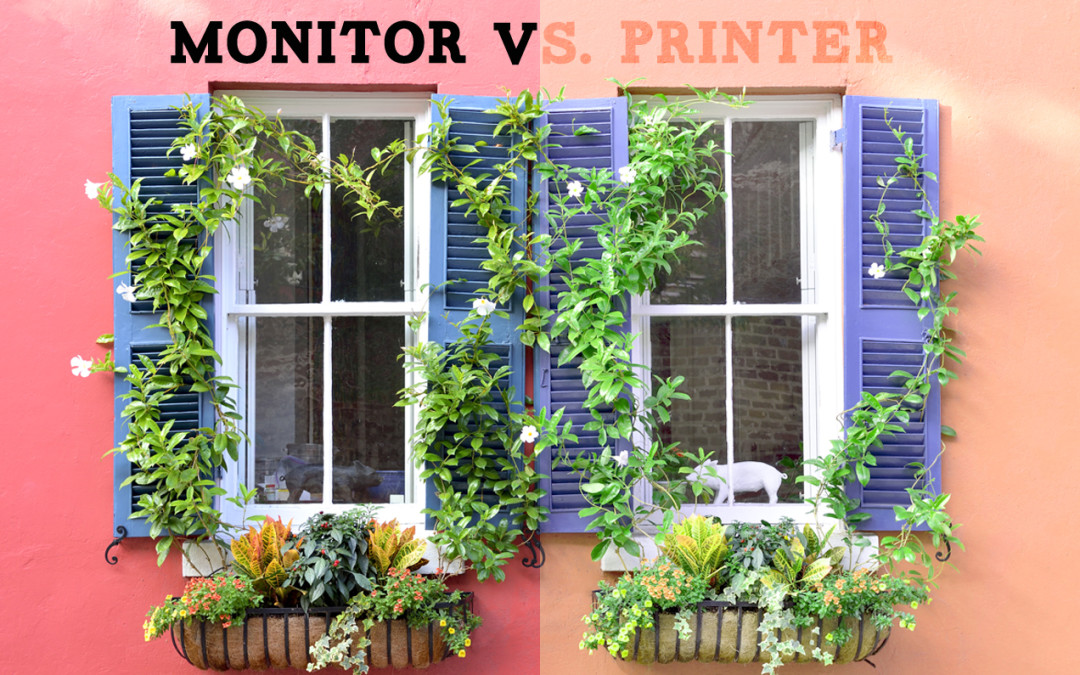
You’ve spent lots of time editing your photo to look exactly the way you want it to. You send it off for printing but when you get your print back it looks noticeably different from the way it looked on your monitor, the way it is “supposed” to look.
Or maybe you have an original painting or drawing you had digitized but when you look at the file on your monitor it looks “off.”
What’s up with that? How can you make sure that doesn’t happen again? Did the printer just do a bad job? All good questions.
This may not provide much consolation, but let me tell you that we all face this issue regularly. Some variation simply comes along with having prints made. The difference in monitor manufacturer, contrast ratio, brightness level, color gamut, and other factors will all contribute to a variation between one monitor and another. You can even get two of the exact same monitors and often they won’t look exactly the same.
On top of that, there will be variations in printers, inks, and even differences in the ways individual papers are able to show color.
It is also worth mentioning that there isn’t necessarily one objective way that a photo looks. There may be the way you are used to it looking on your monitor, but others will not know what you’re expecting if they haven’t seen the way it looks on your end first hand. This doesn’t mean all hope is lost though as there are some things you can do to make these differences not so drastic.
So why does this difference between one monitor and another or a monitor and a print happen and what can we do about it?
This is a long post, but reading the entire thing will give you a great idea of the issues we must face when printing. It will focus largely on the monitor side of things, but we’ll start off by talking about some basic inherent differences between the way monitors and prints handle color.
But first, if you don’t feel like reading this entire article then here is a super short version:
SUPER SHORT VERSION
Eyes, cameras, and monitors work in one color space whereas printers work in another, and the two are not completely equal to one another. Furthermore, computer monitors have multiple characteristics that make one look different from another. Your monitor is what you use to view your images. But if you have not done anything to calibrate your monitor, then what you are seeing on your end isn’t balanced to any color standard and thus it can’t be relied on to show accurate color. One major, necessary step you can take to overcome this is to calibrate your monitor using a calibration device. Even though that will have some limitations depending upon your particular monitor (all monitors will have some hardware limitations and thus can only ever be expected to be so accurate), calibration is always step one in getting any sort of accuracy, and until you’ve done that your monitor can’t be expected to be a reliable example of how the color and brightness of any particular image will translate to another monitor or print; if you want increased color accuracy, you must be calibrated to a known color standard.
Think about it this way: if you wanted to measure something you would go get a tape measure or a ruler because you want to use something that you know has been made to a known standard, otherwise your measurements would be unreliable. You wouldn’t just go grab a stick and mark lines on it and call them inches. Color work is the same way. If you aren’t using something balanced to a color standard then it’s unreliable.
OK, on to the longer version.
RGB VS. CMYK

A necessary baseline for starting this conversation is understanding that monitors/cameras/eyes work differently than printers when it comes to color. Everything mentioned below is reference in the image above. The visual aid can help it to make more sense.
Here’s one way to think about it. If your eyes are closed, if your monitor is turned completely off, if your camera gets zero light, then what do you get? Black. The blank starting point in each of these cases is black. However, if you go to your printer and start off with a blank piece of paper then what do you get ? White. The blank, starting point for printing is white. So, having two systems with opposite starting points, you can probably already start to see how there will be some difficulty in getting colors the same between the two. In fact, there are some colors we see in an RGB color space that don’t exist in a CMYK color space.
RGB is what’s known as a primary additive process. It’s called this because it starts with black and “adds light together” (more specifically adds the primary colors of red, green, and blue light) building up to pure white (you’ll get to see examples of that below).
CMYK is a secondary subtractive process. It’s called this because it starts off with white and the tiny dots of ink laid down on the page “subtract” or filter out light to get to the deepest black possible for any given printer/paper combination. The colors cyan, magenta, and yellow are called secondary colors because they’re each made up of combinations of primary colors of light (for fun, cyan is made of equal parts blue and green, magenta is made of equal parts blue and red, and yellow is made of equal parts red and green). Why is there a K there? Because cyan, magenta, and yellow all mixed together don’t make a very deep, neutral black, so the addition of a dedicated black (K) takes care of that.
The most important takeaway here is that we’re forced to convert between two different color systems, systems which simply do not contain exactly the same colors, and therefore we’re nearly always going to face some differences between the two.
A USEFUL EXAMPLE
Imagine that I give you a blank piece of paper and a box of 75 colors and then ask you to make me a piece of art. You could pretty easily do that and it may look something like this:

Now, imagine that I give you a second piece of paper and a second box of colors, but this time there are some key differences:
1. The new piece of paper is not the same brightness or color temperature as the first (paper brightness is not as high as monitor brightness).
2. The new box of colors only contains 50 colors rather than the original 75 (we can print less colors than we can see or capture).
3. Of the 50 colors in the new box, only 25 of them are the exact same colors from the first box, the other 25 are colors which vary from the first box (RGB and CMYK do not have the exact same sets of colors with CMYK being more restrictive).
4. The new box of colors has no white in it (when printing fine art prints there is no white ink, and thus the brightest white possible is the blank paper).
After all this, I then ask you to make me an exact copy of the first piece of art you created. You can probably see pretty easily that no matter what you do you simply will not be able to make an exact copy. Maybe you can get pretty close, and maybe you can make something that looks nice, but it’ll never be exact because of the limitations inherent in the process. So, it may look something like this:

And here is an idea of how the two results may look side by side:

The result on the right may look great as a print, and it may even be that nobody really perceives any appreciable difference unless they’re analyzing it directly beside the original. Nonetheless, it isn’t and cannot be an exact match to the first one for the reasons described above.
This is a useful analogy of the situation we face when going from monitor or original artwork to print, and it helps to keep this in mind when setting your expectations.
Now we’ll dive more into the monitor side of things.
HOW MONITORS SHOW COLOR
With so many different computer monitors out there and a list of specs that often look like a foreign language it can be difficult to know which monitor is better than another for your particular use. Some computers even have monitors built in and so you don’t have much choice. Having said that, there are some general features that all monitors share that will be relevant to what we’re doing, namely color work and image editing, and will help to explain why monitors look different from one another.
PIXELS
Your monitor screen is made up of a bunch of tiny pixels. The word pixel comes from picture element, and is used to refer to the smallest element of an image. Each pixel consists of a red, green, and blue dot or line that combine together to give the overall color of that particular pixel. To illustrate this idea, here is roughly what you would see if you were to look at your monitor with a loupe or powerful magnifying glass:
![]()
As I mentioned, it’s the combination of one of these red, green, and blue lines that comprises an individual pixel, and this is because it is the combination of this red, green, and blue information that makes up the overall color and brightness information for each pixel. Each of these red, green, and blue lines can be illuminated at various brightness levels independently of one another, almost like a dimmer switch on a light, and they come together to form the colors you see on screen.
To further illustrate this point, which is very important, let’s have a look at some other colors and how they look at the pixel level on a monitor. If you have a loupe or a powerful magnifying glass then now would be a good time to grab it. You can use it to look at the individual color boxes below and see the detail for yourself.
Here is white:

Though it may seem counterintuitive at first, as you can see, white is made up of equal parts of red, green, and blue, and the highest brightness level available of the monitor will determine just how bright the white is. You can test this yourself with a strong magnifying glass or loupe. Get one and have a look at the white box above and you will see it is actually made up of tiny bits of red, green and blue.
Here’s black:

Notice how, like white, the red, green, and blue are all illuminated but at a much lower brightness level. For this reason your screen will not ever really reach a true complete black because at any moment even the darkest black will have some illumination to the pixels. Our monitors will show 99% of the Adobe98 color space. Black is the reason it’s not 100%.
This also shows us how all truly neutral colors are combinations of equal parts red, green, and blue. So, for example, if we take the white example above, keep them equally red, green, and blue, but just reduce the brightness of each pixel in the same proportion to one another then we will get progressively darker grays until we get to black. For some fun, and to really solidify the idea, let’s look at some other colors.

Notice how this blue is almost entirely made up of just blue and green pixels. If you look really closely you may be able to see there is the tiniest amount of red in there too. Here’s a pink color:

Notice how all colors are present, though red is by far dominant and the greens are proportionally quite reduced. Speaking of green, here is a green example:

As you can see, this particular green color is almost entirely just the green element of the pixels with a little bit of red added in. Now let’s look at yellow:

Wait a second. That’s not yellow, that’s red and green. Yep, yellow is actually red and green light combined. Again, you can try this out at home on your own monitor and see how different shades of yellow are mainly combinations of red and green light. Here’s a blueish green:

Like the blue example above this one is mostly green and blue, but notice how this one has more red thrown in. Finally, let’s look at a cranberry red color:

It’s dominantly red but also with noticeable green and blue added. That should be enough to get the point across. Which is what exactly?
THE PIXEL TAKEAWAY
So what’s the point of all that? The main idea to take away is that your monitor is made up of tiny pixels of red, green and blue information, and this red, green, and blue information is combined in very specific ways to create every color your monitor can possibly show. The variation in the way one monitor natively combines these elements results in a variation of how a color appears on different monitors. If the red, green, and blue colors on your monitor are not combined in the same way as they are on another person’s monitor then you do not see the same color and brightness they do. And this is a huge part of why our monitors don’t match one another’s or our prints.
It’s important to note that a monitor doesn’t change the color information in the file itself, only the way that information is displayed varies.
Think about a restaurant that’s full of TVs showing the same thing. Even though the TVs are all getting the same signal and showing the same images they often look drastically different from one another. And the idea illustrated above plays a huge part in that. But it doesn’t tell the entire story, so let’s touch on some other monitor variables.
CONTRAST RATIO
Many monitors show a contrast ratio listed in its specs. But what does that mean? In short, contrast ratio is the difference between the darkest black a monitor can show and the brightest white it can show expressed as a ratio. So, for example, a contrast ratio of 300:1 means that the brightest white the monitor can show is 300 times brighter than the darkest black it can show. A contrast ratio of 1000:1 means that the brightest white the monitor can show is 1000 times brighter than the darkest black it can show. Here is an example of a higher contrast ratio:

And here is an example of a lower contrast ratio:

Notice how the white in the first example is brighter than the white of the second example. Also notice how the black in the first example is darker than the black in the second example. This results in the second example appearing relatively lower contrast than the first one.
So what does this have to do with anything? it serves to illustrate that different monitors with different contrast ratios will naturally have different limitations in what they can show and how they show it. While it may be tempting to take the bigger is better approach, I will note that a higher contrast ratio isn’t necessarily a better thing. There’s no universal standard of contrast ratio and the full implications of it, so while you may buy a monitor with a high contrast ratio, that doesn’t say anything about its ability to show the fine steps between the full brightness and deepest darks. Subtleties are vital when it comes to accurate reproduction. .
Think of a speaker when you’re listening to music. You may be able to crank it up really loud, but that doesn’t necessarily mean the music sounds better. In fact, many times it makes it sound worse and serves only to distort the sound. This variation of contrast ratio and its implications on the monitors overall performance will naturally result in differences between the way one monitor and another looks when showing the same thing.
Finally, and most importantly, the contrast ratio has serious implications when it comes to printing. Just like a monitor has the brightest white it can show and the darkest black it can show (its contrast ratio), so does a print. When you are printing you cannot get a brighter white than the blank paper itself, for example. Printing will always have an overall lower contrast ratio than what your monitor can achieve, so if your monitor is set to have a higher contrast ratio than is realistic for printing then you will simply not be able to see a good approximation of what to expect in print. On a more techincal note for those interested, we calibrate our monitors for a target brightness of 100cd/m3 and find this to be a decent balance, though going as low as 80 isn’t unreasonable.
CHANGING BRIGHTNESS LEVELS
This one is pretty straightforward. With the push of a button you can make your monitor darker or brighter. While that can be very useful in certain circumstances it has a major effect where accuracy is the goal. Here’s the same image at two different brightness levels:

As you can see, these are both the same image but one is darker than the other. I can brighten my screen to get the one on the left, or darken it to get the one on the right. But notice how much difference that makes. The difference in brightness affects everything. The colors aren’t the same, the saturation is different, the contrast is different, etc.
The key thing this illustrates is that with the simple push of a button you can brighten or darken your screen, and that affects the way it appears to you on your monitor, but it doesn’t affect the information contained in the file itself.
If both of the files above were sent to the printer they would come out the same because the only thing that was changed was the brightness of the monitor and thus how it appeared on the screen. As such, the brightness level your monitor is set to when you are editing an image has a major impact on output. If your monitor is too dark you will be inclined to over brighten it. Conversely, if it is too bright you may not brighten the image enough, or you may end up seeing an image on the screen that is brighter than you can realistically expect to get in print.
Furthermore, is the brightness of your screen the same as mine? Is it the same as your friend’s screen? Is it even the same as your phone? More importantly, is it balanced to any known color standard at all? Look at the same image on multiple devices and you’ll see that, most likely, it isn’t the same, and varying brightness levels of a screen clearly have a major impact on the way the image appears to you. So if you have three devices and they all show color and brightness differently, then which one is correct?
Part of properly profiling a monitor is setting an accurate target brightness, and once that’s set you have to leave it there. I’ve known many people to calibrate their monitor, it then appears darker to them (because the monitor was too bright for print accuracy in the first place) so they then proceed to increase the brightness on the monitor. Doing that will destroy the relative accuracy you just created.
FILE INFORMATION VS. FILE DISPLAY
It’s been referenced several times already, but it’s worth addressing in its own space. A digital file contains numbers which represent the information they contain. For any given pixel there will be its particular color information.
No matter what device you put the file on that color information will stay the same, what will change will be the way that particular system displays the information. That’s why your computer, phone, TV, and tablet can all show the same image in different ways and thus why calibrating a monitor is so crucial. We want to bring what’s being displayed more in line with the actual information contained in the file. The variable is the way the information is being displayed, not the information contained in the file, and thus the monitor is the part to address.
COLOR GAMUT AND COLOR SPACE
Let me start off this section with the main point in hopes it may help along the way: You can’t see colors that your monitor can’t show, even if the file itself may contain those colors, and not all monitors can show colors the same way. Furthermore, you can’t print colors that the printer doesn’t have, even if you can see those colors on your monitor.
Let’s define a couple terms real quick, and if they don’t really mean anything to you that’s just fine, the important part will be shown in images:
Color gamut is the full range of colors that can be shown on a given device under given circumstances. That’s a fancy way of saying that all monitors (and printers, for that matter) have a limit to the range of colors they are capable of showing. Note that color gamut and number of colors aren’t necessarily the same thing. Imagine two boxes of crayons. They both contain 24 colors. One box is a normal box with the standard variety of colors available. The other box is a special blue edition which consists of 24 different shades of blue. While they both have 24 colors, the normal box contains a wider overall range of colors and thus has a wider color gamut. Like this:

Color space is a fancy way of saying a map that determines how colors are laid out. It’s a guide for where each color falls within the total colors that are available.
So how does this apply to our monitors? Well, not all monitors are created equal. The consequence of that is any given monitor will be limited by the full range of colors it has the capability of showing, in other words not all monitors have the same color gamut. While some monitors may be engineered to show very bright, saturated colors, which can look nice if we’re watching a movie, they can seriously fall behind when it comes to showing subtle tones and thus be majorly limited in how accurate it can be. This is kind of like the speaker example I mentioned above. Cranking the color up to 100 is not the same thing as being able to show 0-99 accurately, and in many cases the consequence of 100 is a decreased ability to show 0-99; if your sky has 99 subtle gradations then you want to be able to show as many of them as possible rather than showing them all as 100.
Let’s put this to practice in a meaningful way. Two of the most popular color spaces are Adobe98 and sRGB (and chances are that many if not most of the images you work with will ultimately be in one of these color spaces). While both of these color spaces are capable of showing the same overall number of colors, they do not show those colors in the same way. The colors are “mapped” out differently, and Adobe98 is able to show brighter, more saturated colors than sRGB can. We won’t dive deeper into it here, but for those that this means something to, the number of possible colors is a function of bit depth, not color space. For example, any 8-bit file can theoretically contain the information for up to approximately 16.7 million colors regardless of color space. What color space will affect is where the individual colors fall relative to one another.
Many monitors are limited in their ability to show color. They can only show a smaller color space whereas more expensive graphics monitors can show almost all of the larger Adobe98 color space (usually 99% to be exact. Remember, above we determined it could never show pure black because even black will always have some illumination to the pixels). Here’s a useful example to show the implication of these limitations:

As you can see in the above example, both of the blues have the same numbers, namely R: 84, G: 125, and B: 187, but they don’t look the same. Why? Because they are in a different color space. So if we take the blue on the left in the larger Adobe98 color space and we assign it the smaller sRGB color space then the color on the right is what we get, it’s the best we can do! It’s worth noting that different areas of the color spectrum have different limitations, so some monitors might be able to show the same, say, reds as one other but will have more significant differences in the blues. So what does all this stuff above amount to?
You can’t see colors that your monitor can’t show, even if the file itself may contain those colors. Different monitors will have different native abilities to show colors in the first place, and the color space of your file will also dictate available colors, and so if you are working on a monitor that can’t show the same range of colors, or can’t show the same subtlety of colors, then there will necessarily be differences between the way something looks on one monitor and another (and in print).
HOW PRINTERS PRINT COLOR
Now that we’ve talked about how monitors show color, why there’s variation, and some inherent limitations, I want to quickly show a more detailed view of how printers print color. This is equivalent to showing the magnified pixels on a monitor.
Earlier in this post I mentioned that monitors and printers work in different color spaces and thus handle color differently. I want to focus on the part where monitors/cameras/eyes start with black and build up to white (you got to see examples of that in the color blocks above) whereas printers start with white and filter out light to achieve a given color. Printers do this by laying down tiny dots of ink, and those dots all come together to make the print we see. When magnified a print looks like this:

As you can see, nothing is one solid color. Each area is a combination of dots of various colors coming together to give the impression of a solid color. This is magnified significantly, so you wouldn’t be able to see it this way when looking at the print. But you can get a sense of how it works by walking as far away from your computer as you can and looking at the image.
Also notice that there are no white dots, the only white present is where the paper stays blank. This is very important because it means that the white of the paper becomes both the basis for the overall value of the print as well as the brightest white that the print can possibly achieve. And since people often have their monitor brightness set much higher than the brightness of a piece of paper it’s very common for prints to come out darker than expected.
Hopefully at this magnification you can get a sense of how differently monitors and prints work and why some variation is to be expected in going from one to the other. In going from camera/screen to print there are necessary changes and physical limitations which limit the overall accuracy that we can achieve in print. In other words, when printing there are almost always color shifts by necessity.
THAT’S EXHAUSTING, WHAT CAN WE DO ABOUT IT?
Well the good news is that there is something we can do about it. On your end, it’s pretty simple actually. The best, most immdiate way to minimize these variables is to calibrate your monitor to a known, industry wide color standard. And you can do that with absolutely minimal effort. It helps even more if you get a high quality monitor made for color work.
MONITOR CALIBRATION
Nobody really likes to hear it, but you simply cannot reasonably expect that a snapshot from your phone or viewing a file on your uncalibrated monitor will give you higher color fidelity than a professional, properly color managed system. Yet, this is often exactly what we expect. Calibrating your monitor is the most critical step in getting better, more accurate color. It cannot be overstated how important it is.
Calibrating your monitor creates a monitor profile. To put it simply, a monitor profile is a set of instructions that tells your monitor how to more accurately show colors.
Calibrating your monitor is as simple as buying a monitor calibrator and following the simple, step by step instructions. The software that comes with the device will flash up a bunch of different colors on your screen. The calibration device is put on your monitor and it will read each of the colors as they flash up on the screen. The software knows how the colors should appear and the device will read how they actually appear on your particular monitor. Then, once that’s been done with a bunch of colors, the software will create the set of instructions of what needs to be changed to bring the colors as they appear better into alignment with how they should look, which is to say it creates the monitor profile. From that point the profile is applied to your monitor and, ta da, you get improved accuracy. Here’s an example of what it looks like during calibration:

A few popular systems are the Spyder, and the Xrite i1 line. They come with everything you need to calibrate your monitor. When we all calibrate our monitors it brings them closer to being in alignment with one another and results in fewer variances from monitor to monitor. Without proper monitor calibration we would simply not be able to do accurate color work. We personally use the i1 Display Pro.
MONITOR QUALITY
As mentioned above, different monitors will have different physical limitations, and so an inexpensive monitor can’t be expected to perform as well as a high end graphics monitor. The better monitor you’re able to buy the better performance you can expect to get from it. You may find that the monitor you already have is just fine. The more colors the monitor can show then generally the better job it can do at showing your photos more accurately.
It’s very important to note that just because a monitor is expensive or you think it looks really great doesn’t mean it’s well suited for color accuracy. Looking good to humans is what most monitors are made to do, which is not the same thing as being accurate, and certainly not the same thing as being suited for printing or color work. Out of the box most monitors are way too bright with way too high of a contrast ratio to be used for proper printing work. Consider this, if your monitor is set to be much higher contrast than a print is even capable of attaining then, by necessity, there will be noticeable differences between your screen and print.
Not everyone can justify the price of an expensive monitor. It will still generally benefit you to calibrate what you do have with the understanding that there will simply be limitations. Many people find that after sending a few things in for print they get a general sense of what differences to expect between their monitor and the print and they adjust the images accordingly.
MONITOR VIEWING CONDITIONS
The conditions under which you’re viewing your print or original artwork relative to your monitor makes a significant difference. Here’s a way to think about it: let’s say I give you two prints that look identical to one another. However, one of them is lit only with a very bright blue flashlight. The other is lit only with a candle. You can pretty immediately understand how the two prints will appear very different from one another under these circumstances. Why is that? To simplify, the two prints will have very different brightness levels (the blue flashlight is much brighter than the candle) and very different color temperatures (the light from the flashlight is very blue while the light from the candle is very warm).
Viewing a print or original relative to your monitor will be a similar situation. Why? Because the print or original painting will be lit by the light in your room where you’re viewing it while the file will be lit by the computer screen. They won’t have the same brightness level, they won’t have the same color temperature. And thus you aren’t really making an apples to apples comparison. Part of profiling your monitor will be setting its target brightness level and it’s target white point. The more the light in your room varies from those targets the more discrepancy there will be between what you see in hand and on screen.
PRINTER AND PAPER PROFILES
As with the monitor and printer limitations mentioned above, different types of papers will have similar color shifts. The brightness, white point, and ability to absorb and hold ink will all play parts in how a print looks on a given paper. In fact, even when printing the exact same file to different papers there will be variations, and that’s simply a natural part of the process. Printing on a paper with a warmer white point will necessarily have the effect of warming up the entire print.
To tame this as much as possible we build custom printer profiles for each type of paper and canvas we print on. These profiles work the same way as monitor profiles do by seeking to make adjustments to keep print colors as accurate as they can be.
A key takeaway here is that different papers have different characteristics and thus introduce their own variations to a final print. Even when calibrating a monitor the paper will still have an effect of the way the final print looks. A monitor may be calibrated to a known color standard, but that doesn’t mean that any given paper is capable of reproducing the full tonality that exact same way (and as a general rule, it won’t be).
FINAL THOUGHTS
While that’s a lot of information and it can be overwhelming it’s important to keep the main idea in mind: Different monitors show the same images differently for a variety of reasons, but we can tame those differences by calibrating our monitors. Likewise, monitors and prints also show images differently because of inherent differences in how they work. We can help with consistency by also building printer profiles.
Even if we properly calibrate our monitors and our printers their inherent limitations will almost always lead to some differences, but the good news is that the calibration will work to bring those variations more into alignment with one another. Some people find that the difference between their monitor and the prints we make for them isn’t enough to warrant any extra effort, they’re happy with them just like they are. So if it’s your first time printing it’s worth ordering a small print as a test. From there you can decide if you’re happy with the results and if you think it’s worth making the effort to calibrate your monitor.
In certain situations, such as reproducing paintings, there may only be so that close we can get to the original.
It’s also important to keep these things in mind if you’re not printing but instead just getting your artwork digitized. No matter how good of a job we do on our end, the way the files look on your monitor won’t necessarily be representative of the color fidelity of the file, and even with a good file there are limits to color accuracy, especially in prints.
If you have any questions about color calibration and making your prints look more like you are expecting you can always get in touch with us.
We hope this has been helpful!